
(ThyBlackMan.com) Many different graphs and charts are available when it comes to analyzing business data, processes, and other metrics. These graphs come in many shapes and styles, from bar graphs to line charts to histograms. However, today, we’ll be examining the scatter plot. Scatter plots are an excellent tool for visualizing trend data and relationships between variables. This article will cover what a scatter plot is, when they’re used, and some of its benefits.
What are scatter plots?

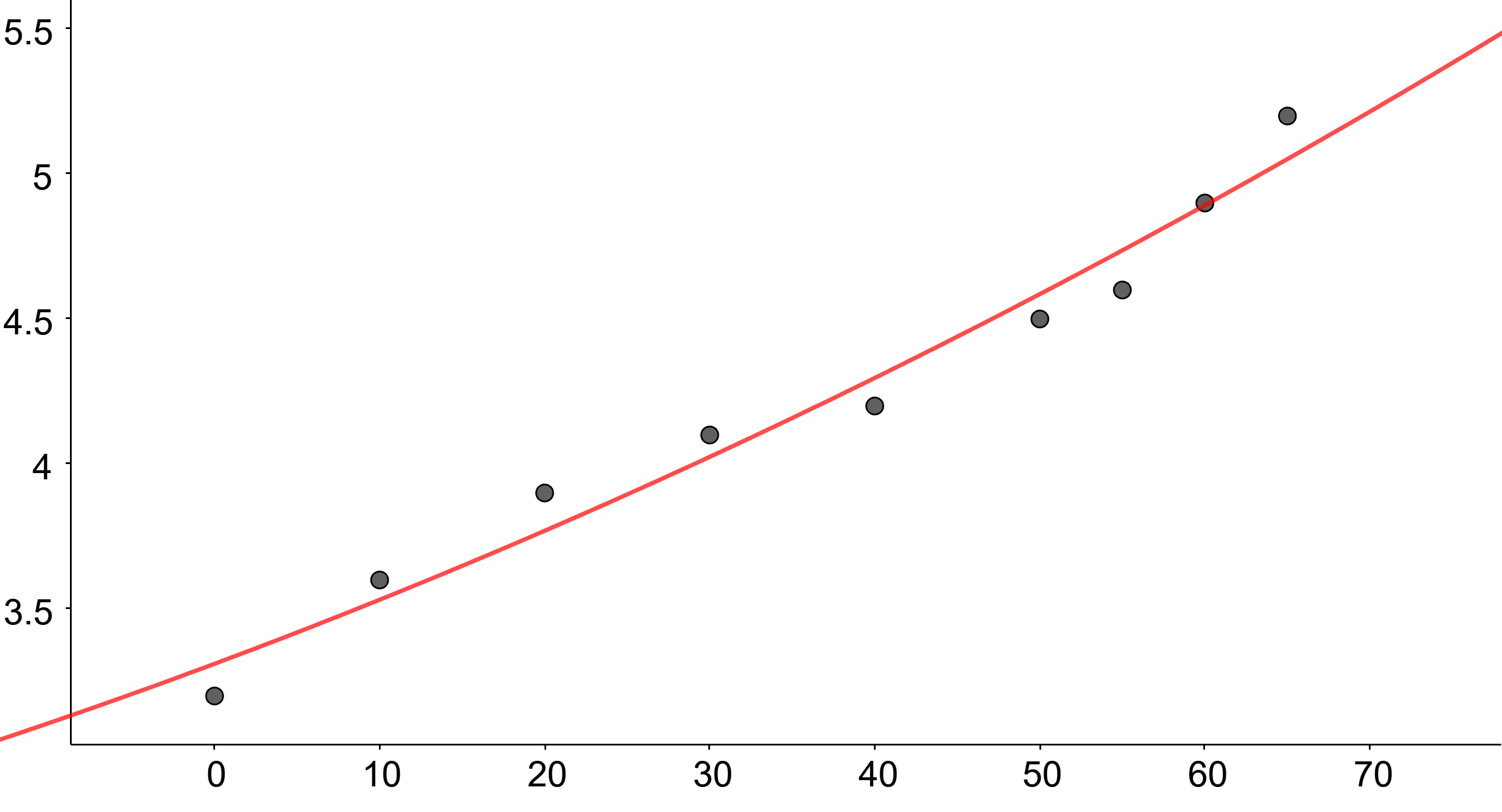
The first thing you may be wondering is, “What is a scatter plot?” A scatter plot is a graphical representation of data in which the points are plotted to show the relationship between two variables. The first variable is displayed on the x-axis, while the second variable is displayed on the y-axis. A scatter plot can be used to identify any linear or nonlinear relationships between the two variables.
A scatter plot can be used to identify any linear or nonlinear relationships between the two variables. If there is a linear relationship between the two variables, the points will be plotted in a line. If there is a nonlinear relationship between the two variables, the points will be plotted in a curve. By looking at the scatter plot, you can identify the type of relationship between the two variables and the strength of the relationship.
How do you interpret a scatter plot?
The interpretation of a scatterplot depends on the type of relationship that exists between the two variables. If the points are randomly distributed, there is no relationship between the two variables. If the points are clustered together, then there is a positive relationship between the two variables. If the points are scattered apart, there is a negative relationship between the two variables.
You can do several things to improve the clarity of a scatter plot. The first is to add a trendline. A trendline is a line drawn through the points on the scatter plot to identify the linear relationship between the two variables. The second thing that you can do is to add a smoothing curve. A smoothing curve is a curve that is drawn through the points on the scatter plot to identify the nonlinear relationship between the two variables. The third thing you can do is add a title to the scatter plot. The title will help identify the purpose of the scatter plot and the data sets it’s displaying.
When would you use a scatter plot?

A scatter plot can be used in business to visualize how two different variables are related. This type of graph is especially useful when you want to see if there is a trend or correlation between the two variables. For example, you could use a scatter plot to compare the sales of a product in different stores. This could help you identify any patterns in the data and make better business decisions.
Patterns in data can help you make better business decisions by revealing insights that you may not have otherwise been aware of. Patterns in data can also help you identify trends. For example, if you notice that your sales have been gradually increasing over time, this may indicate that your business is growing. Alternatively, if you notice that your sales have been gradually decreasing over time, this may indicate that your business is in trouble.
Identifying patterns and trends in your data can be extremely helpful in making informed business decisions. By analyzing your data, you can better understand what is and is not working for your business and make changes accordingly, all from the data you used in your scatter plot.
Start utilizing scatter plots for your business data.
Now that you’re familiar with scatter plots, how to interpret them, and when to use them, you can start taking advantage of their many benefits.
Staff Writer; Jason Carter
